Tonight, I did a very rapid exploration of the Reykjavik index, in the context of the #MakeupMonday challenge, which I discovered today.
This index was developed by Kantar to quantify how women are perceived as leaders compared to men.
The index varies between 0 and 100, the maximum representing a country in which people feel that women are as legitimate and competent as men over 20 professions. Needless to say that no country currently holds a 100 score. The index also takes into account the how men and women hold different perceptions of this legitimacy.
The data are here provided for the G7 countries, and the index was estimated by surveying over a 10000 person.
The data
data <- read_xlsx("2019-03-20-reykjavik_index.xlsx")data %>% kable()| Country | Reykjavik Index |
|---|---|
| United Kingdom | 72 |
| France | 71 |
| Canada | 71 |
| United States | 70 |
| Japan | 61 |
| Germany | 59 |
| Italy | 57 |
| G7 Average | 66 |
The file is quite small, with the score for the seven countries and the average over the G7 countries. There is not much cleaning to do. I improve the column name, make countries a factor and order it by index, and extract the average value to remove it from the dataframe.
G7_average <- data[data$Country == "G7 Average", 2]
G7_average2 <- data[data$Country == "G7 Average", 2][[1]]

data <- data %>%
  rename(reykjavik_index = `Reykjavik Index `) %>%
  mutate(Country = fct_reorder(Country, reykjavik_index)) %>%
  filter(Country != "G7 Average") %>%
  mutate(to_colour = ifelse(reykjavik_index < G7_average2,
                            "under", "over"))
The colourfull barplot
My instinctive first graph, a barplot. I colour the country, because I think it’s prettier.
data %>%
  ggplot(aes(x = Country, y = reykjavik_index,
             fill = Country)) +

  geom_hline(yintercept = G7_average2,
             size = 1, linetype = "dashed",
             colour = "grey50")  +
  geom_col() +
  coord_flip() +
  annotate(geom = "text",
           label = "G7 average",
           x = "Italy",
           y = 80,
           size = 5,
           colour = "grey50",
           #fontface = "bold",
           family = "Roboto Condensed") +

  ylim(0, 100) +

  labs(title = "Reykjavik index per country",
       subtitle = "Higher values represent less gendered views about leadership",
       fill = "",
       x = "",
       y = "Reykjavik index for leadership",
       caption = "\nSource: https://data.world/makeovermonday") +
  my_theme +
  theme(legend.position = "none") +
  scale_fill_manual(values = wes_palette("Zissou1", n = 8, type = "continuous"))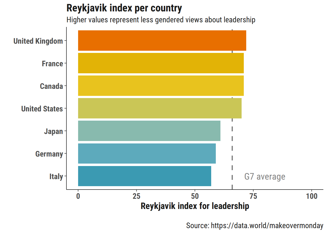
As first drafts go, I think it is actually not that bad: we can clearly see which countries are slightly above and under the average. We could split the countries in two groups and plot the difference to the mean, but I am not sure it is that pertinent: of course some are going to be over and some under, that’s a mean after all.
The less colourfull barplot
I don’t want to spend a lot of time on these plots, so I will stick with barplots tonight and not go into wild creations. Tonight I believe in simplicity (and laziness).
But I will try to highlight the two groups, and add some annotations to convey the message a bit better.
data %>%
  ggplot(aes(x = Country, y = reykjavik_index,
             fill = to_colour,
             #colour = to_colour,
             label = reykjavik_index)) +

  geom_hline(yintercept = G7_average2,
             size = 1, linetype = "dashed",
             colour = "grey50")  +
    geom_col() +
  geom_text(aes(y = reykjavik_index - 3),
            colour = "white") +
  coord_flip() +
  annotate(geom = "text",
           label = "G7 average (66)",
           x = "Italy",
           y = 82,
           size = 5,
           colour = "grey50",
           family = "Roboto Condensed") +

  annotate(geom = "text",
           label = "Countries with higher\nagreement that women\nare as suitable as men\nat leadership positions",
           x = "France",
           y = 87,
           size = 3,
           colour = bar_col1,
           family = "Roboto Condensed") +

  annotate(geom = "text",
           label = "Countries wich hold\nmore prejudices against\nwomen leaders",
           x = "Japan",
           y = 87,
           size = 3,
           colour = bar_col2,
           family = "Roboto Condensed") +

  geom_hline(yintercept = 100,
             colour = "black",
             size = 1) +

  ylim(0, 100) +

  labs(title = "Reykjavic Index - What people really think of women leaders",
       subtitle = "\nIn the best cases there is still more than 1/4 of the road to travel to reach\nequal confidence in men and women abilities to lead\n",
       fill = "",
       x = "",
       y = "Reykjavik index for leadership",
       caption = "\nSource: Kantar, via  https://data.world/makeovermonday") +
  my_theme +
  theme(legend.position = "none",
        axis.ticks.y = element_blank()) +
  scale_fill_manual(values = c(bar_col1, bar_col2)) -> plot1

plot1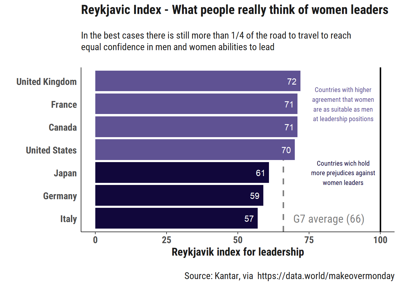
I want a slightly interactive version of the plot, so I use the ggplotly() function from the plotly package.
ggplotly(plot1,
         tooltip = c("x", "y"))
Here, this is it. Less than two hours from data download to online post, that was my aim for a quick first exploration. Additional bonus: now, I know how to write Reykjavic!